since 1976

since 1976
From BMW Press Release
More than 100 years after its creation, the BMW roundel remains one of the world's most recognisable brand symbols. Yet one of the most widely held beliefs about the logo is not entirely accurate.
Few brands are as recognisable around the world as the BMW logo. For more than 100 years, the iconic roundel has been synonymous with innovation, engineering excellence and driving pleasure.
Yet despite its global recognition, one of the most widely held beliefs about the BMW logo is not entirely accurate.
Contrary to popular belief, the BMW logo was not originally designed as an aircraft propeller. Instead, its origins lie in the visual identity of predecessor company Rapp Motorenwerke and BMW’s early history. The famous propeller association emerged years later through an advertising campaign that would go on to create one of the automotive industry’s most enduring brand myths.
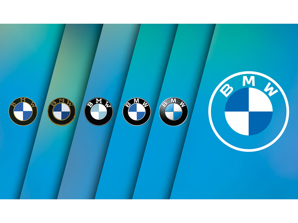
The BMW logo was registered in 1917, shortly after Bayerische Motoren Werke GmbH was founded as the successor to Rapp Motorenwerke GmbH. Rather than creating an entirely new symbol, BMW retained the distinctive black outer ring from the Rapp logo while introducing the blue and white quadrants associated with Bavaria.
The colours were a deliberate reference to the company's origins in Munich and the state of Bavaria. Due to trademark regulations at the time, the Bavarian colours could not be reproduced exactly as they appeared on the state flag, resulting in the familiar blue and white arrangement seen in the BMW roundel today.
Historical records confirm that the logo was created to represent BMW and its Bavarian origins, rather than an aircraft propeller.
The origins of the propeller story can be traced back to 1929, more than a decade after the logo was first registered. At the time, BMW was producing aircraft engines and published an advertisement featuring the BMW logo superimposed within the spinning propeller of an aircraft.
The image created a powerful connection between BMW's aviation expertise and its brand identity. The association gained further momentum in the 1940s when a BMW company publication reinforced the connection between the BMW roundel and aircraft propellers.
Although the story was compelling, historical research has since confirmed that the logo pre-dated BMW's first flight-tested aircraft engine, making it impossible for the propeller to have been the original inspiration.
What began as a clever piece of advertising image ultimately evolved into one of the world's most enduring brand myths.
Today, the BMW roundel continues to represent far more than a corporate logo. It symbolises more than 100 years of innovation and progress, connecting BMW’s Bavarian heritage with its future as a global premium mobility provider.
While the propeller interpretation remains an important part of BMW history, the true story of the logo is equally compelling. More than a century after its creation, the BMW roundel remains one of the world’s most recognised corporate symbols.
BMW Logo Timeline
1917
BMW registers its trademark, combining elements of the former Rapp Motorenwerke emblem with the blue and white colours associated with Bavaria.
1923 The BMW roundel appears on the BMW R 32, the company's first motorcycle.
1929
A BMW advertisement depicts the logo within a rotating aircraft propeller, creating the visual association that would become one of the brand's most enduring myths.
1942
The propeller interpretation is further popularised in a BMW company publication.
Today
The BMW roundel remains one of the world's most recognised corporate symbols, representing BMW's heritage, innovation and global premium positioning.